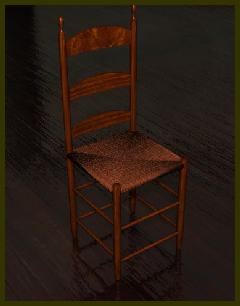
A 3D render from a photo by Sam Abell. Next, some web research turned up
enough photos of Shaker style chairs to base a model on. A separate
scene was started in order to build the chair. A similar setup with the
chair photos set up on semi-transparent planes was used for a template.
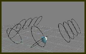
The legs and rounded stretchers were drawn with curves, then lathed.
The curved slats for the back also began as curves. These were then
converted to polygons, and swept to slightly larger than their final
thickness. In order to form the gentle bend of the slats, more geometry
would need to be added. Heavily quad-divided primitive cubes were used
to trim the front and back faces off the slats with Boolean operations.
The 'Delete Edges' option was unchecked for the Boolean subtraction,
leaving the quad-division lines from the cubes now transferred to the
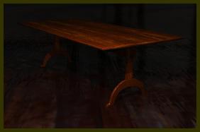
slats. They would give the Bend Tool more faces to The next pieces of furniture to be
built were the trestle tables for the back hall. Once again, web
research provided enough photos of representative tables to base
a model on. Simple construction sped the process, which consisted of
slightly rounded cubes for the top and stretchers; Curves were used to
draw the outline of the bow-shaped lower legs. Surfacing was again a
shader/ texture combo. The tables were placed in the back room in front
of the windows where they would cast advantageous shadows, and some
chairs then tucked up against them. The final items to be modeled were
the two matching stoves. The reference photo lacked enough detail, but
subsequent web searching turned up close up photos of a Shaker stove.
The models were based on these. Simple construction made for a simple
model, again made of rounded cubes for the stove body and
cylinders for the legs and stovepipe. Textures were provided by
pictures of the surfaces of an actual woodstove. With all the models in place, I
began working on finalizing textures. The walls are a two layer blend
of plain colors-2 shades of white- a slight bump map, and for
reflectance, mapped phong with a mask on the diffusion channel. This
gave the walls a dirtier, aged look than are present in the photo,
where they look freshly painted. I say: Never let reality stand in the
way of a good render. Most of the models had been textured as they had
been built, so only minor adjustments were needed to match tones and
diffusion levels, or to hide any repetition. The floor went thru many,
many revisions using a variety of settings. It ended up a 3 layer
combination of the wrapped wood shader, photo textures in the color
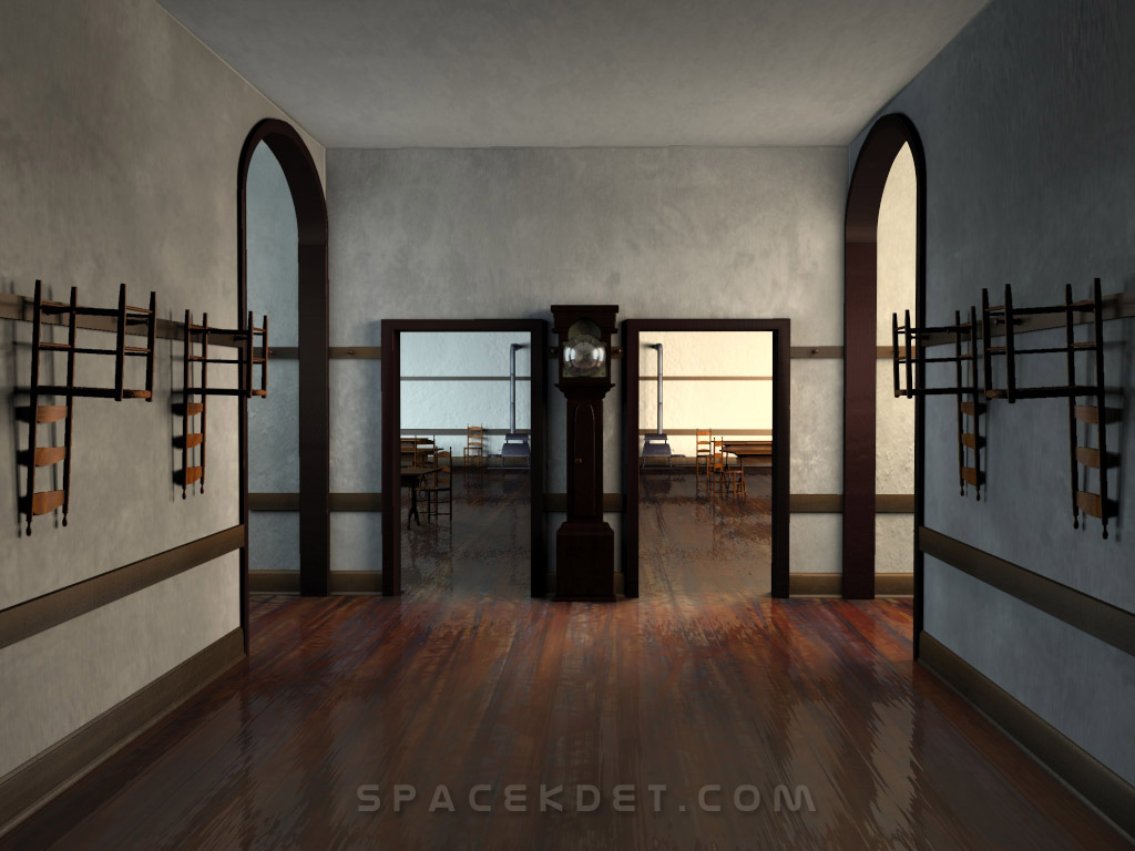
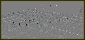
channel, and Caligari Phong and TG Blur in the reflectance channels. By far the most time was spent on lighting. I also asked for and got plenty of help in this task first from Robert 'Trebs' Mitchell, and later from Brian 'phaedrus' Lanehart. My own experiments began with an area light outside each doorway and window. The results were less than satisfactory, considering I was using raytraced shadows. Render times were slow, and the lighting looked bad, with strange shadowing and artifacts. In the spirit of cooperation, Trebs asked if he could take a whack at lighting the scene. I zipped up the basic wall structures and sent them overseas. In a matter of literally minutes, Rob had constructed an array of about 25 local lights in a rough ring around the scene. He also added a spotlight pointing up at the ceiling due to the fact that they often aren't lit properly and 'get lost' in tS renders. This also helped alleviate some of the shadowing artifacts I was getting using only area lights. He also used shadow mapping instead of ray tracing, which is what I normally use. However, both Rob and Anthony 'Bobbins' Ware pointed out what I was doing wrong and why I could never get good results from shadow mapping. They informed me that I really needed to 'crank up those settings'- set shadow map size numerically to at least 1000 (don't accept the default High setting, which is way too low) Sharpness to '1' (counterintuitive), and push that Quality spinner all the way up to 9. Needless to say, the results were much, much better once I was armed with this information. It also however, pointed out a lack of a way to manage large numbers of lights in trueSpace. A native tool to do tasks of this sort , or a 'Gaffer's Assistant' plug-in is needed, in my opinion. The ability to select a group of lights and change all their parameters at once would be a huge workflow improvement. I then began tweaking and tweaking this large array of lights. First I realized that the right side needed a warmer color than the left to cue the eye that the sun was on the right. I sampled the wall color in the original photo to obtain the RGB values for the warm and cool colors. Each string of lights per side was then adjusted to match. The intensity levels were also dropped on the left side to be less bright than the sunlit side. At first, the results were much better than my initial area light array, but after about 20 test renders those damn light areas at the top of the left wall were creeping back in. It really had me stumped because I just could not figure out what was causing it. While talking about it in IRC channel #truespace, Brian Lanehart offered to try his hand at lighting the scene. I once again archived the scene and sent it south to Birmingham Alabama. He had been experimenting with Image Based Lights and from the results of some of his tests I was anxious to see what he could do with the Shaker scene. On his own, he had constructed a test hallway and was already well on his way to having a working setup even before the actual scene file arrived. The rig consisted of an IBL at each window in the rear hall, one inside the front hall, one in the left arch and two in the right arch, along with 2 spotlights. All shadows were raytraced. The color and intensity scheme stayed the same, warm and bright on the right, cool and dim on the left. Brian's explanation follows: "The goal was to create a radiosity feel without the render time and prove that soft shadows are possible with ray-type shadows. All of my attempts at lighting are with ray type shadows. At the time, I was experimenting with large light arrays (35+ lights for the front right hall alone) of area lights with their min and max subdiv. set to their respective min and max. This approach was working well enough generating wonderfully soft-edged shadows, but I wasn't completely satisfied with the result due the array configuration causing unwanted lighting in the back room, so I pulled out the IBL. During the set up phase, I kept the resolution to the minimum just to get an idea of how the light would interact with the scene. After building a much simpler light rig with IBLs, I set the IBL fuzziness to 1 and cranked the resolution up to 32 for a simplified test scene render (no textures, no objects). The render time was horribly unacceptable (10 IBLs in the scene, each at 32 resolution), but the results were perfect. From here, I added back the textures and objects, pulled the resolution down to 16, and rendered the final image. Talking with other ts-ers on IRC, they thought I was truly insane for attempting area and IBL arrays, but in the end, we all agreed the results were worth it." The final shot was rendered over a long weekend using Brian's copy of trueNet. The results are below, click for a full size view. If you wish, you can check out a selection of test renders which show the project in the various stages of completion
Click image for larger version
|
| Previous |
| Next |